
Do you have data but don’t know how it can help you improve your services? Are you designing a new strategy but are unsure about where most support is needed? Or do you need help with creating an infographic for your impact report? Then maybe we can help you. We use data analytics – big and small, quant and qual – to support social and public sector organisations with monitoring, planning and decision-making. Find out more about how we use data and how we can help you make most of yours.
1. Build capacity
We provide custom tools to help organisations and partnerships understand their strengths, weaknesses and impact, as well as practical tools to help charities cost their services effectively. We recently redeveloped our Organisational Strength Review tool and you can now try it for free. Find out more and download for free here. This is the first in series of freemium tools to help build capacity and support organisations in their work. So keep an eye out for more.

2. Understand local needs
We have a wealth of experience in delivering high quality research and analysis across our specialisms. Using a range of different data sources, we are able to produce local needs analysis to help organisations understand the context they are working in. Having direct access to the Charity Commission register database, we are able to provide an overview on the voluntary sector in a local area. We are experts in official data on employment and welfare statistics and draw on other resources, such as the indices of multiple deprivation or the British Red Cross Covid-19 Vulnerability Index, to understand needs.
3. Monitor ongoing progress
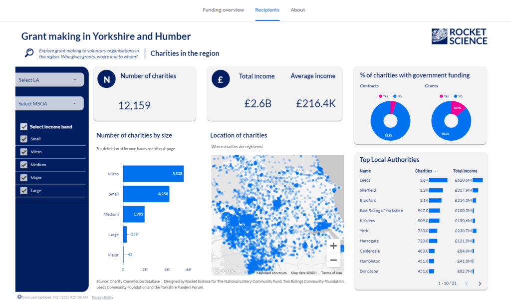
We build tools that can measure the value and return of investment as organisations deliver a project or following delivery. We have helped a number of organisations to setup up robust data collection tools. By understanding the wider context and what data capacity is available, we can develop self-serving tools that are bespoke to each setting and easy to use. We can also create dashboards to display a project’s progress in a visual and effective way using a range of tools from Excel to Google Data Studio.

4. Tell stories with your data analytics
Any data visualisation tool can create a graph, but is it useful? We deliver insights to help with impact reporting and decision-making. During the pandemic, we have produced data stories for a number of clients to better understand the impact of Covid-19 on local communities. We can help with slide decks, infographics and visual reports or create interactive dashboards and blogs to provide a way for users to interact with your data. We also develop bespoke static or interactive maps to explore geographic trends of services, partnerships or beneficiaries.

5. Share best practice
We are continuously learning and updating our knowledge of tools and data out there to add value for our clients. We’re keen to work in the open and share our knowledge, for example through social media and other networks. We not only do the work but also offer training sessions for organisations around data. For example, how to make most of data, how to organise and work with spreadsheets or impact reporting for small organisations.
Two months ago, I started sharing #ThursdayTools with my team every week and I thought this might be useful for others too. So here’s a list of open, non-code tools that I use for #dataviz, #dataforgood, charity data, maps, infographics … 😎
— Lisa Hornung (@LisaHornung_) July 15, 2021
1/
Get in touch
Do you need help with a piece of analysis? Looking for an interactive dashboard or infographic to display your impact report? Email me at lisa.hornung@rocketsciencelab.co.uk or link up with me on Twitter or Linkedin.
Lisa is a Data Analytics Lead at Rocket Science. Find out more about her here or get in touch via email.